Calligraphy Ink Basics
As an Amazon Associate I earn from qualifying purchases.
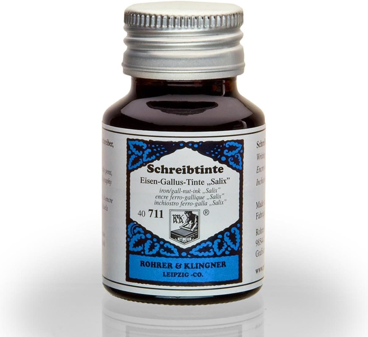
Ink is the most underrated variable in pointed pen calligraphy. Beginners blame their nib or their hands for spidery hairlines and blobby shades when the actual culprit is sitting in the bottle. Unlike fountain pen ink, which is engineered to be thin and free-flowing through a feed, dip pen ink needs body: enough viscosity to cling to the nib in a film, flow steadily through the tines, and sit on the paper surface rather than soaking in. Understanding a few ink families will solve most flow problems before they start.
Sumi ink is the workhorse recommendation for beginners, and for good reason. This East Asian carbon ink is dense, silky, and opaque, producing rich blacks with crisp edges. Moon Palace and Kuretake are the bottles most often mentioned. Sumi's viscosity is nearly ideal straight from the bottle, though it thickens as it sits open, so keep a dropper of water nearby and thin it a drop at a time when strokes start dragging. Decant a small amount into a dinky dip jar rather than dipping into the main bottle, since dipping introduces paper fibers and dust that shorten the ink's life.
India ink is closely related but usually contains shellac binder, which makes it waterproof when dry and lethal to nibs when neglected. Dried shellac is very difficult to remove, so if you use india ink, rinse your nib every few minutes rather than every session. Iron gall ink sits at the opposite end of the texture spectrum: thin, almost watery, and beloved for the finest hairlines achievable. It goes down pale gray-purple and oxidizes to deep black over hours. Its acidity slowly corrodes steel nibs, which is simply the price of those hairlines, and it makes rinsing and thorough drying after each session non-negotiable.
Walnut ink deserves special mention for practice. Sold as crystals you dissolve in water, it is cheap, transparent enough to show your stroke construction, flows beautifully, and produces warm sepia tones that look far better than the price suggests. Many calligraphers do all their drills in walnut and save sumi for finished work. On the decorative end, gouache mixed with water to the consistency of heavy cream turns any watercolor shade into calligraphy ink, and metallic inks like Finetec palettes deliver genuine shimmer for envelope work, applied to the nib with a brush rather than dipped.
Viscosity tuning is a skill worth practicing deliberately. Ink too thick drags, produces gloopy shades, and refuses to release hairlines. Ink too thin bleeds into paper fibers, spiders along the hairline, and drops off the nib in dots. The test is simple: write a few compound curves. If the hairline skips, thin the ink with a drop of distilled water. If hairlines feather into fuzz on paper you trust, the ink needs thickening, which means leaving the jar open for an hour or adding a drop of gum arabic to improve cling and sheen.
Care routines keep the whole system healthy. Rinse the nib in water and wipe it fully dry the moment you finish, since water left on steel invites rust along the slit. Store inks capped tightly and stir rather than shake, because shaking introduces bubbles that transfer to your strokes as voids. Never leave a nib soaking overnight. And label your jars, because diluted sumi, walnut, and iron gall look nearly identical in dim light while behaving completely differently on paper. A tidy ink shelf, a dropper bottle of water, and the habit of testing on scrap before committing to a final piece will do more for your line quality than any premium nib purchase.