Chalk Lettering
As an Amazon Associate I earn from qualifying purchases.
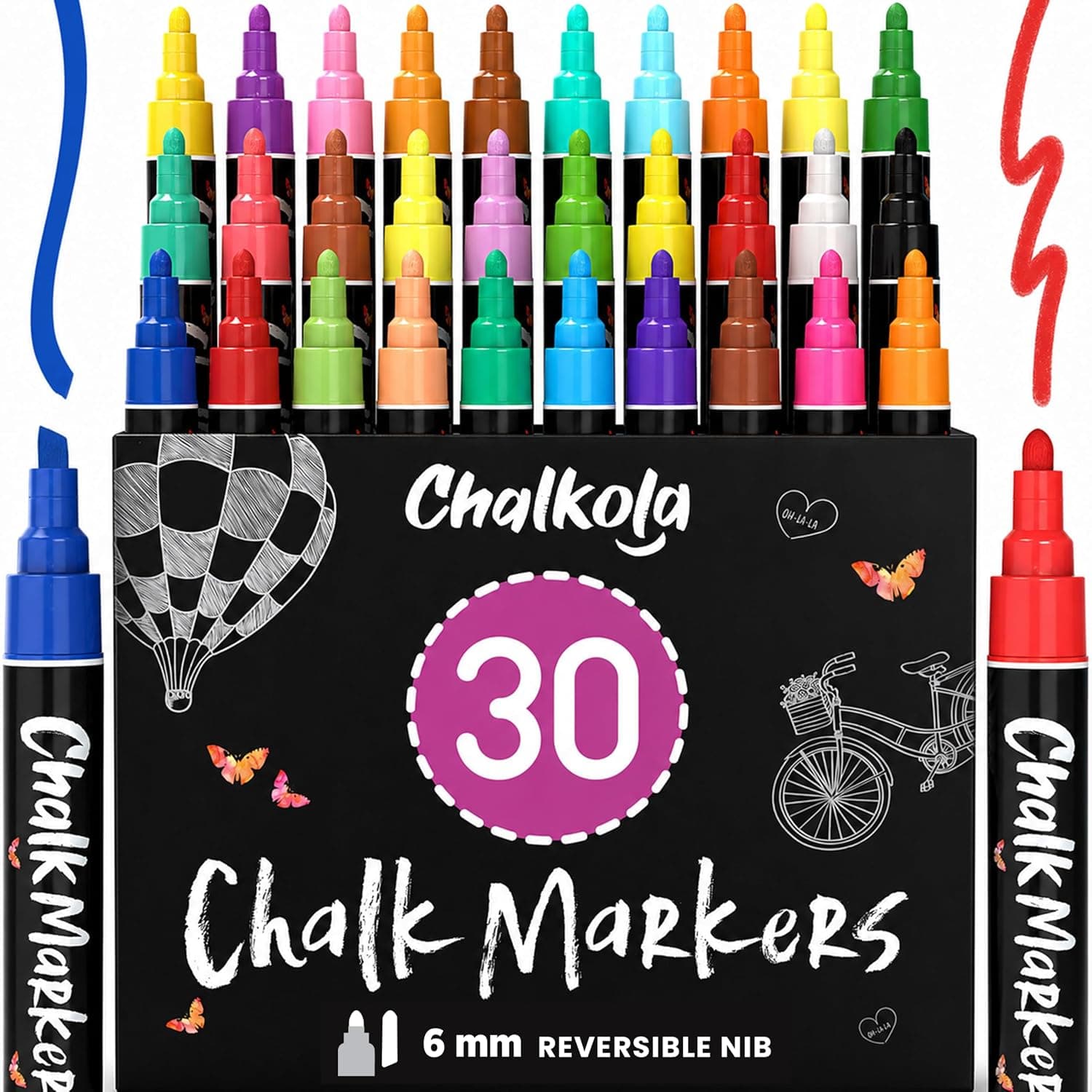
Chalk lettering occupies a special corner of the lettering world because it is large, temporary, and forgiving. A chalkboard invites experimentation in a way that expensive cotton paper never will: every mistake wipes away, every layout can be revised, and the finished piece has a warmth that printed signage cannot fake. Cafes, weddings, market stalls, and home kitchens all run on chalk signs, which also makes this one of the most requested practical lettering skills.
The first choice is traditional chalk versus chalk markers, and they are genuinely different tools. Stick chalk is soft, dusty, blendable, and erases effortlessly, ideal for art with shading and for boards that change daily. Chalk markers are liquid pigment in a pen body: they produce crisp, opaque, vivid lines that photograph beautifully and survive touching, but they erase only from truly non-porous surfaces. This is the single most important thing to know in chalk lettering: a chalk marker on a porous board, including many boards painted with chalkboard paint, will ghost permanently. Always test a marker in a corner before lettering a board you care about, and assume porous until proven otherwise.
Prepare a new board by seasoning it: rub the side of a chalk stick over the entire surface and wipe it off. This fills the microscopic pores with chalk dust so future lettering does not burn in as ghost images. For layout, work exactly as you would on paper but bigger: measure and snap light guidelines with a ruler and chalk pencil, sketch the whole composition loosely with a light chalk outline, step back to judge it from viewing distance, and only then commit with your final lines. The step-back habit matters more with signs than with paper because signs are read from meters away, where thin strokes vanish and cramped spacing turns to mush.
Lettering technique on chalk is faux calligraphy almost by definition, since neither chalk sticks nor markers respond to pressure the way brushes do. Write your script in monoline, then thicken every downstroke with a parallel line and fill. At sign scale this is a feature: faux construction is the only practical way to build letters six inches tall with consistent stroke weight. Combine one script element, usually the key word of the sign, with simple structured styles for the supporting text, block capitals or a narrow serif drawn with the same fill technique. The contrast between one flourished word and quiet companions is the entire visual formula of the classic cafe board.
Details elevate chalk work fast. Highlights are the signature move: after filling a thick stroke, draw a thin line of bare board or a white line inside it along one edge, and the letters pop into dimension. Simple drop shadows on the lower right of letters do the same. Banners, laurel sprigs, corner flourishes, and rule lines fill empty space and frame the text, and they are all built from strokes a beginner already has. Keep a small dry brush for cleaning up edges, a damp cotton swab for precision erasing, and a ruler for anything that must be straight, because at large scale a slightly drifting baseline is visible across the room.
Care and correction round out the craft. Erase stick chalk with a dry cloth first and a barely damp one second, letting the board dry fully before relettering, since wet boards eat chalk lines. Remove stubborn chalk marker with a magic eraser sponge and water on sealed surfaces. Photograph finished boards straight-on in soft light before they are wiped, both as portfolio and as a record of layouts worth repeating. And embrace the temporariness. The board being erasable is what gives you license to attempt compositions bolder than anything you would risk on paper, and that boldness is exactly what feeds back into the rest of your lettering.